Has America’s ongoing obsession with low-gluten diets caused the inexorable increase in mass shooting deaths?
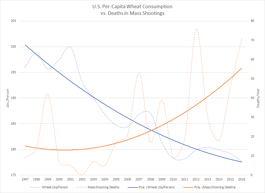
It’s a pretty dumb question, and the obvious answer is “no.” But with some raw data, spreadsheet software, time, and creativity, it’s pretty easy to make a graph that seems to imply a negative correlation between Americans’ average consumption of wheat and the trend in mass shooting deaths.
All you need is the United States Department of Agriculture’s data on wheat consumption, population estimates from the United States Census (1990-2000, 2000-2010, and 2010-present), and the mass shooting data from Mother Jones. Throw all of that into a spreadsheet, do some math, make a graph, and here you go:

Despite the compelling graph, the statistical correlation between average wheat consumption and mass shooting deaths is tenuous at best.
You can determine whether two sets of values are correlated using the Pearson correlation coefficient (which is available in Excel as the CORREL function). This will give you a value between -1 and 1. A value of -1 means that the two sets of data have a perfectly negative correlation (when one goes up, the other goes down). A value of 0 means there is no correlation at all. A value of 1 means that the data has a perfectly positive correlation (when one goes up, the other also goes up).
The relationship between two sets of data is generally considered to be significant if its correlation coefficient is at least -0.5 or 0.5. In the case of average wheat consumption vs. mass shooting deaths, the correlation coefficient is -0.49 . . . which is surprisingly close to being significant, but isn’t. Sorry. (Always beware of charlatans bearing deceptive graphs.)
I made the average wheat consumption vs. mass shooting deaths as a joke for my friends on Facebook a while back. It was never intended to be a serious observation. But more recently, I took a serious look at the relationships between some other sets of data.
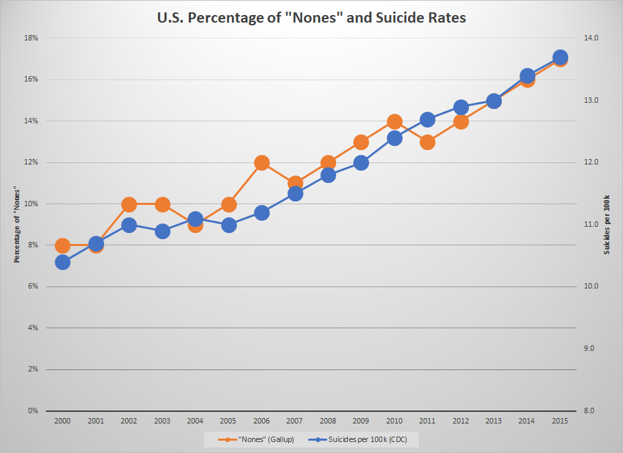
For years, I’ve been reading articles about the rise of the “nones,” meaning people who do not profess any religious faith. According to Gallup’s long-running polls about religion, the percentage of Americans who say they have no religious belief has more than doubled since 2000. I’ve also been reading a lot about a troubling increase in suicides over that same period. I wondered if maybe those two trends were related.
So I started making another spreadsheet. I used Gallup’s data on the percentage of Americans who are “nones,” and compared that to U.S. suicide rate reported in the Centers for Disease Control’s death data (PDF link). The correlation coefficient over the period from 2000 to 2015 came up as 0.96, which is getting pretty close to a perfect positive relationship.
I even made a graph to demonstrate how closely they track with one another . . . at least after you toy around with the scales to get them aligned:

But even though there appears to be a strong correlation, and that is an interesting piece of information, we must not forget the statistician’s mantra: “Correlation does not imply causation.”
Yes, it is possible that America’s turning away from religion has led to an increase in suicides . . . but we can’t infer that from the data. It’s also possible that the increasing suicide rate is leading people to turn away from religion. It’s also possible that the rise of the “nones” and the increasing suicide rate are both caused by something else. And it’s also possible that the correlation is just a coincidence and will not hold over a longer time period.
I knew this before I embarked on this analysis, but one small error as I was putting it together gave me a fine reminder. When I went to calculate the correlation coefficient between the percentage of “nones” and the rate of suicides in America, at first I didn’t get 0.96. I had compared the wrong columns in Excel and got an even higher value: 0.98.
I eventually caught the mistake and corrected it. I had compared the U.S. suicide rate not to the percentage of “nones,” but to the population estimates from the U.S. Census. I had added them to the spreadsheet during some earlier experimentation and had been planning to remove them.
You would expect a relationship between population growth and the raw number of people committing suicide. If all else is equal and the rate of suicides stays steady, an increasing population will see a proportional increase in suicides. But that’s not what I found. I found a very strong positive correlation between population growth and the rate of suicides . . . almost as if people are statistically more likely to commit suicide as the population grows.
Then I compared the percentage of “nones” to the population estimates, and found a slightly lower correlation of 0.97 . . . but that is still a slightly stronger correlation than the one between the “nones” and the suicide rate, which was the original idea I was researching.
I don’t know what any of that really means. It’s all interesting information, but it’s not enough to draw any conclusions from. And that’s what this whole article is getting at: Don’t blindly believe the statistics you read or the graphs that illustrate them. It’s easy to take weak or non-existent correlations and make them look important with cleverly designed tables and graphs. It’s easy to exaggerate small patterns, or hide large ones, by manipulating the scale. It’s easy to pick-and-choose your data points to support an agenda.
Statistics can be a valuable tool, but like almost any tool they can be used for good or evil. They can be used to illuminate the truth or to obscure it. You may have heard the saying, “There are three kinds of lies: lies, damned lies, and statistics.” There’s a reason why that has been such a long-lived and popular aphorism.
Worksheets:

