So, I’ve been playing around with the Microsoft Windows 8 Consumer Preview, a pre-release version of Microsoft’s next flagship desktop operating system. The pundits and techies seem to be very critical of Microsoft’s direction, and with good reason, but I don’t think it’s quite as bad as it’s been made out to be. In fact, with a handful of relatively small changes, Microsoft could make Windows 8 really great.
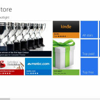
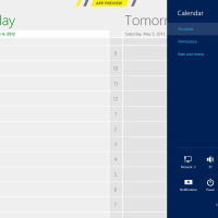
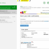
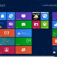
Actually, Windows 8 already is really great . . . on tablets and small laptops. Oh, it has its rough edges (what do you expect from an early preview?), but on the small screen it’s a real pleasure to use. You see, the biggest change to Windows 8 is that Microsoft has made its ‘Metro’ interface—the tile-based system used on its surprisingly-good Windows Phone 7 mobile operating system—the primary way of interacting with the machine. When you’re navigating with your finger on a tablet, or even with a touch-pad on a notebook, Metro gives you a quick and easy way to move back and forth between apps, see an ‘overview’ of your incoming emails and schedule, and then move into an immersive single-app experience.
The included Metro apps—for email, calendars, weather, etc.—are obviously unfinished, but as the universe of Metro apps grows this will get better. It is obvious that the system has a lot of potential to give Apple’s iOS and Google’s Android a run for their money in the tablet space, if the hardware is up-to-snuff and if the development community rallies around the platform.
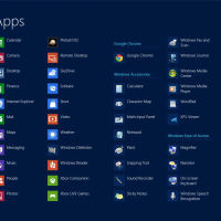
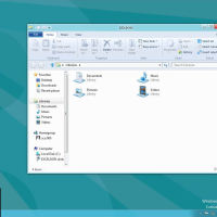
On the small screen, it only falls apart when you run a traditional Windows app. When you do that, it drops you into a semi-Windows 7 environment called ‘Desktop’ where things behave pretty much the same as they do in Windows 7. Needless to say, it’s a jarring change. Now you have overlapping windows, small touch-unfriendly icons, and a general feeling that you’ve clicked into another dimension. I realize that Desktop, like Apple’s ‘Classic Mode’ in the early days of Mac OS X, is a temporary solution to give developers time to move completely to the new paradigm . . . but Microsoft should spend some more time making the shift feel more natural to the user.
Three changes would go a long way toward making Desktop apps fit into the Metro universe during this transitional period: they should apply a clever theme to the Desktop’s ‘Aero’ interface to approximate the Metro interface, maximize apps by default so they behave more like Metro apps, and return to Metro (instead of Desktop) when a Desktop app is closed. If Microsoft did this, the Windows 8 experience on tablets and small notebooks would be immersive, consistent, powerful, and beautiful . . . at least as much as possible when you’re running two completely different kinds of applications on one machine.
But not all of us will be running Windows 8 on tablets and small notebooks. There is still a place in the market, albeit a smaller one than in the past, for multi-monitor workstations and large notebooks. These users should not be left out in the cold. But Metro, as it stands in the Windows 8 Consumer Preview, is an absolute failure on these kinds of machines. When you have two large monitors on your desk, you don’t want them completely taken-over by a full-size Metro app every time you want to look at your email. You want to be able to have your email, Word document, and browser side-by-side and arranged to your liking.
While Microsoft could improve the small-screen Windows 8 experience by making Desktop apps behave more like Metro apps, they could improve the large-screen experience by doing just the opposite: make Metro apps behave more like Desktop apps. On large screens, there should be an easy way to launch and run multiple Metro apps side-by-side in a traditional windowed environment, right along-side their Desktop app brethren. With smart theme design, this could be made fairly seamless (though not perfect) while Desktop apps phase-out over the next several years. Metro apps are already built to be able to scale to different sized screens, so there’s no reason we can’t stick ’em in a window and let the users resize them (within reasonable confines).
In other words, I envision Windows 8 having two distinct (but overlapping) operating modes, each capable of running both Metro and Desktop apps. The first, which I’ll call ‘tablet mode,’ is an immersive environment where apps take up the entire screen, and where you multi-task by switching between apps. The second, which I’ll call ‘desktop mode,’ is a traditional windowed environment where multiple apps can be presented simultaneously and moved around (or maximized to fill the whole space, if desired). The operating system would select the best interface paradigm for you based on the characteristics of your machine (e.g., presence of a touch screen, size and resolution of the monitor[s]), or even the characteristics of an individual screen.
Imagine a tablet, which runs normally in ‘tablet mode,’ but becomes a full-fledged desktop when you connect it to a keyboard, mouse, and large screen(s). The tablet itself would remain in a single-app ‘tablet mode’ as a secondary display, and project a full ‘desktop mode’ experience to the rest of the hardware. Let the users toggle between modes to their liking in the control panel, if they don’t like the automatic selection(s). This system could really be the best of both worlds.
Microsoft has already learned the hard way, with the repeated failures of their past tablet computing efforts, that the desktop experience can’t be scaled down to a mobile device without major changes. But if Windows 8 rolls out in its current schizophrenic state, they’ll learn that lesson’s corollary the hard way too: mobile experiences can’t be scaled up to the desktop without changes either. They are distinct environments, even though they overlap in the middle, and must be treated as such.
But what’s very interesting about Windows 8 is that, with some smart decisions between now and the system’s release, they can save it. There is no technical reason that a two-mode system like the one I’ve described can’t be implemented. It would allow developers to build a single app that deploys seamlessly to everything from handheld 7″ tablets to enterprise-grade hexa-core workstations with four (or more) monitors. With a handful of apparently-minor adjustments to Windows 8, the system could scale beautifully and seamlessly to almost any device imaginable, but it has to be smart enough to behave differently depending on what environment it’s running in. It can’t blithely insist that Metro works un-changed on a multi-display workstation, or that Desktop works un-changed on a tablet. If it does that, nobody will be happy with how it works anywhere.
In addition, Microsoft must permit the ‘side-loading’ of Metro and Desktop apps alike. Apple’s walled-garden approach to computing is a non-starter. I have no objection to the existence of an app market (the ‘Windows Store’) for Metro apps, nor do I object to similar markets for iOS, Mac OS X, or Android. But I should be permitted—if I choose—to download an app from another source and install it. While Windows 8 will continue to support traditional application installation in the deprecated Desktop environment, Microsoft has stated that Metro apps will only be installable through the Windows Store. That is an unacceptable limitation. Power users like myself will not stand for an operating system that does not allow them to install whatever apps they want.
All-in-all, Windows 8 is a system with a lot of potential, but Microsoft has to straighten a few things out yet before it goes to production. Remember, Windows Vista had a lot of potential too . . . and we all know how that turned out. Come on, Microsoft. Don’t mess it up this time.

