I recently read an article titled ‘10 Misrepresentations About Climate Change‘ on Southern Fried Science. The article’s author, ‘WhySharksMatter,’ made a valiant attempt at being balanced, and I applaud him for that. Five of the ‘misrepresentations’ were on the so-called ‘skeptic’ side of the climate change discussion, and the five others were on the climate change ‘believers’ side. Unfortunately though, the article still has a number of flaws.
‘Misrepresentation’ number 1 is somewhat accurate, although the data is presented in a very slanted way. I’ll come back to this shortly.
‘Misrepresentation’ number 2 cites one particular study about how many climate scientists agree on human impact on Earth’s warming, but doesn’t address any of the actual scientific evidence. More recent studies are finding that much of our climate change dogma is inaccurate or dead-wrong. For example, one study found that CFC’s (largely outlawed in most countries now) and cosmic rays are the primary sources of warming, not the CO2 ecological boogeyman. Another found that even if CO2 were responsible for serious climate change, the problem is only half as bad as we thought . . . because nearly half of all human CO2 emissions are gobbled up by plants. So thanks, SUV drivers; you’re helping to keep the world’s plants well fed! Both studies, and countless more where they come from, point to very serious gaps in our scientific understanding of Earth’s changing climate.
This leads to ‘misrepresentation’ number 3. The author claims that ninety-seven to ninety-eight percent of climate scientists agree that humans are responsible for the warming Earth. Well, this may be true, but that doesn’t bode well for those scientists. In light of an increasing stream of studies (like those I cited above) that are chipping away at the long-standing dogma, and the lack of observable evidence for the dire consequences warming was supposed to bring, it’s looking more and more like they’ve been had. As we spend more and more time studying our impact on the Earth, we keep finding that the Earth is pretty capable of adjusting to nearly anything we’ve been able to throw at it. The seas aren’t rising. The number and severity of natural disasters isn’t increasing.
I’m not going to say we’ve been lied to, but, like Presidents Bush and Clinton talking about Iraq’s WMD programs, it’s becoming clear that our climate science community has been basing its conclusions on faulty data from untrustworthy sources . . . even if it was acting in good faith.

But rather than getting into another holy war with climate change believers who haven’t actually studied the available data and choose instead to believe whatever Al Gore tells them (even if what he tells you has many glaring inaccuracies and errors), I’d rather return to the first ‘misrepresentation’ pointed out by ‘WhySharksMatter’ and the chart he uses to illustrate his point.
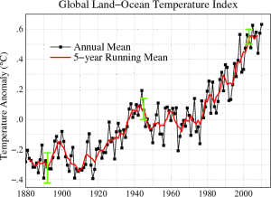
I’ve included at the right a NASA-produced chart, similar to the one in the article, which illustrates global temperature anomalies in degrees-Celsius from 1880 to 2010. It paints a dire picture. Beginning with the industrial revolution, the temperatures begin a serious upward spike that continues through to today. Taking the chart at face value, it looks like we are in very deep, serious trouble.
But look closely at the vertical axis and you’ll realize you’re looking at something very small being made to appear very big. The range is from 0.4 degrees negative deviation up-to a 0.6 positive deviation—a range of only 1.2 degrees. You see, this isn’t a chart of the Earth’s actual temperature, but a close-cropped chart of deviations from the ‘norm’ (which is the average over the defined period). Even putting aside the facts that we don’t really know how normal the ‘norm’ is because we only have reliable direct-observation records for the last 120 years (out of Earth’s 4.54 billion year climate history), and that there are legitimate concerns about the reliability and consistency of the data we do have, it’s still clear that this chart was designed to make the deviations look more pronounced and severe than they really are.

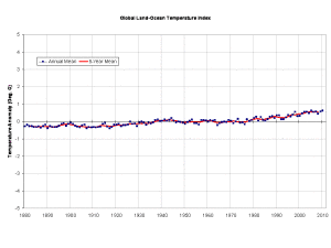
Luckily for you and me, NASA has provided the raw data used to produce this chart for anybody to download and play around with. So here is the exact same information (check the XLSX file if you don’t believe me) presented on a more reasonable 10 degree range. A small correction of your perspective makes a lot of difference, doesn’t it? When viewed in a more reasonable context, the data is a lot less scary, and a lot harder to use to support rash, inaccurate conclusions.
Yes, there still appears to be a positive shift over time. There’s no real doubt that the average temperature of the Earth has increased (slightly) since 1880, but it is hardly the dire, life-threatening swing that NASA’s chart would seem to indicate. Once you scale the chart properly, it becomes clear that we’re looking at very small variations in global temperature—far too little to draw any real conclusions from, especially when you consider that we’re looking at a microscopic snapshot of a very, very long planetary climate history.
Has human activity contributed to that 1.2 degree increase in average temperature anomalies over the last 120 years? If we are being honest with ourselves, there is insufficient data upon which to base any conclusions. We only have observable, empirical evidence of temperature patterns for such a short period of history that we are kidding ourselves if we think it tells us much of anything. Even the small bit of data that we have is likely unreliable and subject to error; weather stations move, they get closer or further away from population centers as people move and cities change, we add more stations in more places and get ever-more accurate data each year. Is a 1.2 degree shift due to actual changes in Earth’s climate, changes in how we gather and calculate the data, or some combination of both? How can we be sure?
To be perfectly clear, I am all for sane environmental policies. I want clean air and clean water as much as the next guy. I want us to get off fossil fuels for both environmental and national security reasons as soon as we possibly can. But we have to balance environmental concerns against other concerns when we craft public policy, and we must prescribe remedies that don’t overestimate the severity of the situation. There is no reliable evidence that we are facing any kind of environmental cataclysm due to climate change. Even if the measured temperature increase over the last 120 years were conclusively proved to be due to human activity, there is no evidence that it poses any serious or immediate cause for concern. Yes, we should cut down on pollution and CO2 emissions, but whether we do it in 2 years or 200 likely won’t make much of a difference. The Earth is much more resilient than we give her credit for.
So let’s keep this all in perspective, shall we?

