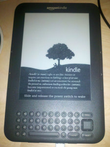
Unfortunately, my Kindle 2—which was my first e-reader—met its untimely demise when I, suffering from a 24-hour stomach bug, dropped it from a height of three or four feet onto a hardwood floor. The impact damaged the e-ink display; the top one or two inches quit working. I replaced it with a Kindle 3 (Wifi version), which retails for $139.
I’m not going to do a full review, since the Kindle 3 is functionally very, very similar to the Kindle 2 (which got the full Off on a Tangent review treatment). There are a few notable differences.
First, the Kindle 3 comes in a Wifi-only version (lacking the free ‘Amazon Whispernet’ wireless Internet), which is cheaper than its Whispernet-enabled kin. I saved the money and opted for the Wifi-only version. Amazon also sells a ‘special offers’ version for $114; in return for giving you a Kindle for $25 cheaper, you get ads on the screensaver and at the bottom of the home screen. I opted to spend the extra $25 and enjoy an ad-free Kindle. It also has twice the memory of its predecessor—4gb, which Amazon says is enough for 3,500 books—and the volume controls, headphone port, and power switch have all moved to the bottom next to the USB connector.
The Kindle 3 has the same-sized e-ink display as its predecessor, but Amazon has slimmed the device down around the edges (and removed the number row on the keyboard, which can now be reached through the ‘symbol’ key—not a big deal for the very limited typing you’ll do on the device). It is now 21 percent smaller and 17 percent lighter. The ‘next page’ and ‘previous page’ buttons on the right and left edges of the device are smaller and less responsive than those on the Kindle 2, but they are also much quieter and less conspicuous to press in a quiet room. You win some, you lose some.
The e-ink display itself, while the same 6″ size as that on the Kindle 2, is much crisper and easier to read. According to Amazon it has 50 percent better contrast than its predecessor, and the fonts are also ‘crisper [and] darker.’ The improvement is obvious. The Kindle 2 had a wonderful, easy-to-read display, but the Kindle 3’s is noticeably better. Page refreshes are also much faster—20 percent faster, according to the spec sheet. They aren’t lying. There are also more font options now—default (serif), condensed, and sans-serif; various sizes; and the ability to adjust line spacing and words-per-line settings.
The Kindle 3 still has the same ‘experimental’ features of its predecessor—a web browser and text-to-speech tool. The web browser is hugely improved, now based on the open-source Webkit engine instead of the antiquated NetFront engine. It displays websites just as well as any Android tablet or iPad, except in gray-scale with the slower e-ink refresh rate. It’s sufficient for reading articles on Wikipedia or news sites. The text-to-speech functions work the same as in the previous version, and in a brief test they seem to work just as well (but not noticeably better).
Lastly, I spent an extra $49.99 for the Kindle Lighted Cover. It is a leather cover, only slightly thicker than the Amazon leather cover for the Kindle 2, that comes with a built-in reading light (since the e-ink display is not lighted and works with natural ambient light). It’s a slick design that draws power directly from the Kindle itself (through the clips that attach it to the device). You pull the light out from the top-right of the case and it turns on automatically (if the Kindle is on). I tested it out last night and it worked wonderfully. It’s a worth-while accessory if you ever plan to read in low-light conditions.
All-in-all, a great device. I didn’t expect to buy a Kindle 3 (since I expected my Kindle 2 to last me a while longer; oops), but I’m quite happy with the upgrade. If you’re on the market for an e-reader, the Kindle is king . . . and with good reason. It’s a solid, simple, affordable e-reader backed by the expansive Amazon Kindle bookstore (which is its biggest advantage over its primary competitor, the identically-priced Barnes & Noble Nook).

